Marshfield Clinic

Prioritizing provider search and enhancing patient satisfaction with online clinical quality ratings.

Background

As a private group medical practice in Wisconsin and one of the largest in the United States, the Marshfield Clinic Health System encompasses several entities spanning insurance, medical research, laboratory testing, and information systems. 

The following case study reflects two combined initiatives of my work on the clinic’s public-facing website.

Role

Lead UX Designer, Visual Designer 

Time

4 months (search enhancements)
7 months (provider ratings)

Tools

Adobe Illustrator, Balsamiq, Google Universal Analytics

The Challenges

As part of the Creative Services team, I helped grow the reputation of our in-house digital design capabilities over the span of 3+ years. I participated in many projects for various Clinic entities along the way. The interfaces I designed are seen by thousands of visitors each month on the Marshfield Clinc Health System (MCHS) website, marshfieldclinic.org.

As the starting point for revenue generation, allowing patients to find a doctor and make an appointment are some of the most crucial site functions. The public-facing website was redesigned in 2014 through an outside firm, and was built upon SharePoint 2013.  Dissatisfaction and stagnant performance with the site’s presentation of providers led to the following design challenges:

Increase utilization of provider search within the site

Optimize provider search & profiles for desktop & mobile

Display doctor profiles with a star rating system

Research & Discovery

Digging Into The Data

At the time of this project, the Marshfield Clinic website was structured into three main areas with a dedicated landing page to funnel patients into provider search queries. In my review of the analytics data, it was evident that site traffic showed significant drop-off and exits from this page. 

To begin the research phase, we used Google Universal Analytics tools to investigate what was happening in a typical user journey that started on the doctor landing page. Several things became immediately clear:

  • Site visitors tried to search by first name, last name, and location most often. 
  • Spelling errors were common, especially for providers with unique last names. 
  • Visitors attempted searching with incomplete terms (typically 5 characters or less of a word.)
  • After returning results, users would try to click on the photo of a provider to view additional details.
 
These typical user behaviors would result in empty search results and no functional interaction opportunities.

Nothing Here Matches Your Search

It was troubling to know that much of our user’s search behavior was returning blank results. The internet’s largest search engines had been around for ten years, suggesting terms based on partial (often misspelled) inputs. We theorized that even a rudimentary auto-complete feature would be a worthwhile investment of time and financial resources knowing the system could be adapted to be more reliable over time.

Competitive Analysis

I conducted a competitive analysis to examine existing approaches and features to further brainstorm ideas in improving the search capabilities.

Findings 1: Direct competitors had alphabetical search.

Findings 2: Physician rating sites focused more on accepted insurance, where direct competitors allowed users to search by primary facility.

Focus Groups

For the project of incorporating provider ratings, we knew we would need access to actual patients for our decision making process. Fortunately, we had leadership support. Marshfield Clinic was already sending out “After-Visit” surveys via their patient experience partner, Pres Ganey. The results of these responses would become the dataset to populate initial rating scores.

I advocated to attend one of the clinic’s patient advisory panels and direct the questions posed to the group. The primary goal of discussion was to understand attitudes towards using the After-Visit survey data to report provider satisfaction scores on the MCHS website.

What People Said

The following are two key questions posed to the advisory panel and the group’s aggregate responses.

Have you ever completed an after-visit survey? Why/Why Not?What (survey) categories are most important to you when choosing a doctor?
Yes, to make an impact for others Friendliness/courtesy
No, too busy to fill out Whether the provider is male or female
No, wonder if anyone ever looks at these Time spent with me
Yes, if the experience is very poor or very good Overall personality

Business Requirements

Designing Within Constraints & Scope Creep

Throughout the course of the provider search effort, the use of the clinic’s Content Management System (CMS) became a technical constraint that influenced the final outcome.  There was a hesitation to develop any new templates or styles beyond what was already available within the site’s library of parts. This meant that our solution needed to be feasible without requesting a developer resource.

The business wanted to maximize opportunities for patients to request appointments.  However, at the time, it was not possible to actually request an appointment with a specific provider from the public-facing site.  The project scope was adjusted to include the design of an “appointment request” page for new patients that could also direct existing ones to log into their patient portal and schedule a visit with their provider.   

Ideation

Concepts

By referencing other health care system’s online presence, ideas for the provider profile were sketched to set the grounds for the low-fidelity wireframes to follow. The concepts were shared with my team as well as stakeholders to gather their initial thoughts before going into visual details.

Validation

Usability Testing

Usability testing was centered around provider ratings with the goal of understanding what information was most important to to people when researching a doctor and what influences their decision to request an appointment. 

behind the scenes of usability testing session
View from behind the one-way glass observation room during usability and feedback sessions.

The sessions were composed of three main parts:

  1. Task analysis on search directories, competitor websites as well as the current MCHS site. 
  2.  A card sorting exercise where participants were asked to order chunks of content in the order of importance that they might see on a doctor’s profile.
  3. Preference testing with printed high-fidelity concept designs.
 

Preference testing was the most visual design focused of the three. Participants were asked about which design they felt was most helpful to them in making a decision on requesting an appointment with the provider.  Certain UI controls such as toggles were also prompted to get a sense of whether these features would be easily understood.

Spreadsheet of sorting responses
Rranked summary of the findings for the card-sorting exercise. The most important information had a lower average score. Both provider ratings and comments from patients were in the top rankings. Also shown are new suggestions for future development road-mapping.
Preference testing concepts side-by-side with participant notes.

Development

Final Designs

Before
After

Doctor Search

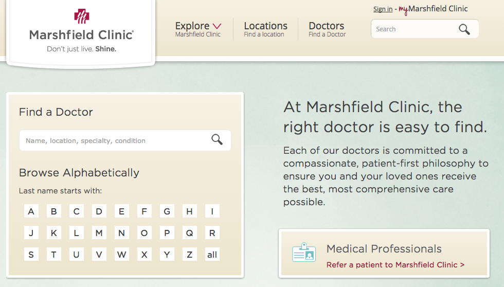
Changes to font styles and list spacing were applied to give the filters a better sense of hierarchy on desktop views. At screen widths below 480px, these filters became contained within a collapsable menu that was closed by default on page load. This helped to ensure that the user could see the results listing after their initial query on mobile devices without needing to scroll past the filters. ​

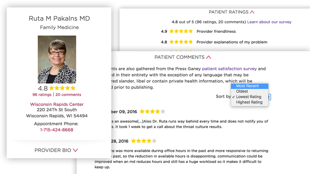
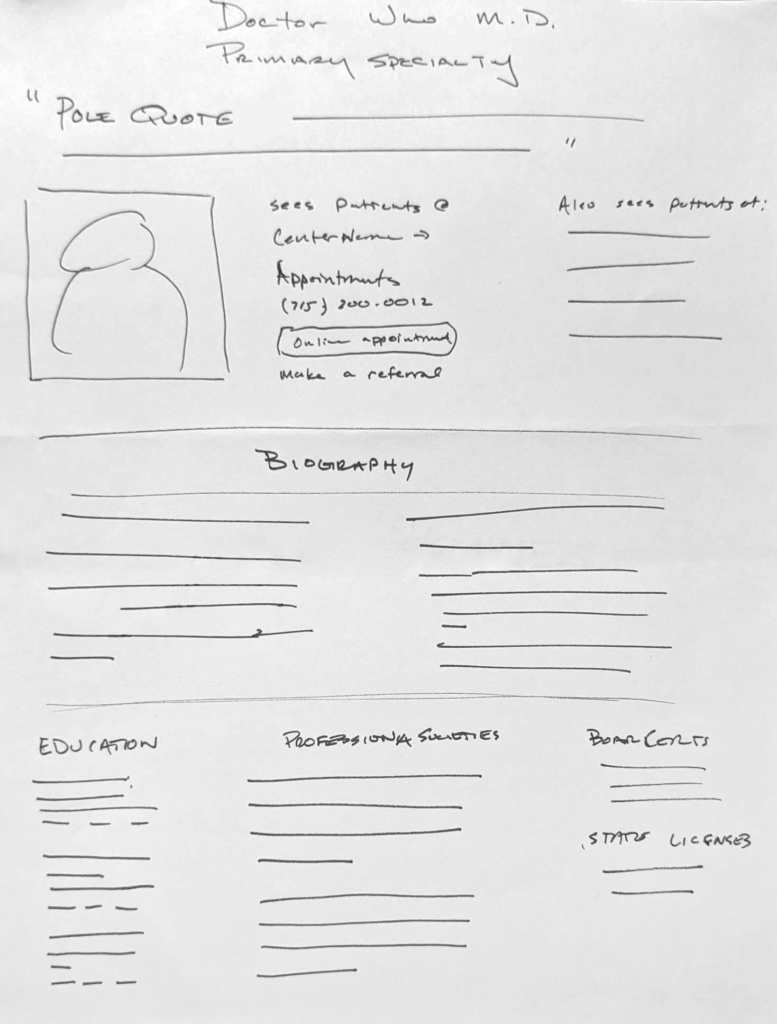
Similar font hierarchy changes were applied to the provider's profile to incorporate labels for each individual's specialties and practice location. Because the clinic could not accomodate specific provider appointment requests, that button was removed. As the result of our research, the label to "View Full Profile" was scaled back to a simple text link and the image became clickable to the provider's profile to align with the way users were already expecting the system to behave.

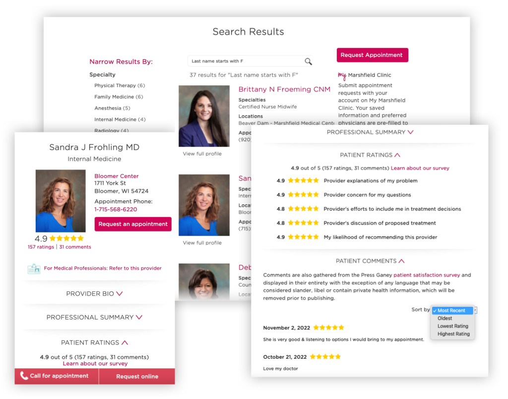
One of the underutilized features was the “My Favorites” section. Although, we did not do any primary research as to why this might be, a regional study¹ about how people research medical conditions suggested that there are numerous factors that affect this decision including: location, reference from a friend, health insurance acceptance, and office staff friendliness. Forming an opinion based on online and offline interaction would be more important than a side-by-side comparison in our product offering. The business wanted to maximize opportunities to request appointments. The favorites feature was removed and replaced by more actionable content that would be useful to both new and existing patients.

1. https://journals.lww.com/jhmonline/Abstract/2011/03000/Selecting_a_Provider__What_Factors_Influence.5.aspx

After UI improvements to the doctors search landing page

On the landing page, we incorporated the auto-complete functionality for the search input which suggested terms based on the first three letters typed. Within the site’s developed CMS was a template part for an alphabetical letter search, which we incorporated into the design based on the use of similar components on competitor sites.  Finally, the search input field was moved to the left side of the page, aligning to the F-Shaped scanning pattern often used by web visitors. This had an added benefit of visually separating the universal site search from the doctor-specific one.

Snapshot of various views of completed provider profile

Provider Profiles

The usability testing sessions resulted in a few notable items in the final designs.

Feedback:  Patients wanted to know where the star ratings originated from and were concerned that negative reviews would not be shown and result in an overly positive presentation of providers. 

Iterations:  The ability to sort included an option to see the lowest ratings and unless the feedback was considered libelous, all written comments would be included. Redactions to lengthy comments or sensitive data was shown as (…) 

Feedback:  The amount of information on the page was considered overwhelming by some and the repeated use of the star rating visual was confusing.

Iterations:  Each section of the page was grouped by an expanding toggle, which would be closed or open to reveal the content by default depending on the section and device the visitor was viewing the page from.

Minor updates were also made to the presentation of the stars themselves and the size of the provider photo. The profile would adapt those physicians with extensive biographies and ratings as well as those with minimal profile information. 

Outcome

Results & Takeaways

Our goal was to improve the Clinic website’s provider search and physician profiles for increased patient engagement, mobile optimization, and improved patient satisfaction through reviews and star ratings. We succeeded in meeting the goals based on department members positive feedback.

Analytics data from the 11 months before and after the redesign revealed statistical improvements to search:

Total Searches

Before:     354,048
After:         772,694

An increase of 116%

Mobile Searches

Before:     82,513
After:      214,600

An increase of 160%

Mobile searches on the Clinic site previously accounted for 23% of instances, after the redesign, that number increased to around 45%. The incorporation of the alphabetical search accounted for 98,176 (13%) of searches overall with 3% of utilization on a mobile device.

"It’s evident to me that the search has been enhanced, search volumes are increasing without an increase in null results and mobile users are finding the collapsible filters useful."

In 2016, marshfieldclinic.org won an American Web Design Award for UX + UI. This competition is Graphic Design USA’s showcase of the power of design to enhance websites and online communications.

Reflecting Back

As part of my own portfolio site redesign effort, I was able to look back on the work I did while with Marshfield Clinic. At the time, I largely didn’t realize that the initiatives I participated in were part of a combined goal to improve the patient experience at an organizational level from Clinic leadership.  It all felt just exciting and interesting to pursue digital design from a objective, research-based perspective. In the years since my involvement, the business has continued on through several mergers, acquisitions, and a global pandemic.

As of Jan. 2023, the website still appears to be built upon SharePoint and although the primary means of provider search has been updated, the doctors landing page, results listing, and doctor star ratings still exist mostly unchanged. Knowing what I do today about user experience and project processes, opportunities for improvement with these projects would have been: 

  • Performing more targeted research on how patients searched for doctors. Specifically the effectiveness of an alphabetical letter search against other grouping means.
  • Separating the tasks within the usability study into two sessions. One that focused more on the competition and card sorting and another at a later time to present designs. Participant fatigue became apparent towards the end of the session and using insights from the card sorting activity could have informed our design decisions prior to presenting them. 
  • Facilitating more dialog between the design and development teams. Communication with this group would have revealed easier ways of modifying the site templates and their input may have influenced some design decisions along the way.  

More projects

Watchdog EX

Scale-Tec REAP